Written by: Hannah Martin
⏳5 minutes of your time could win you a $50 gift card! 🎉Help us design our new adaptive apparel launch by sharing your experience. 👕 Link Here 👈
Introduction
Skincare has always been personal, it's about how products make us feel in our own skin. But there's something we don't talk about enough: the actual, physical experience of using what we buy. But listen up! Here's the thing: accessible skincare packaging isn't just for people with disabilities. It makes life easier for all of us.
Universal Design: Building Better Products from the Start
The beauty industry has made real progress on inclusivity over the past decade. We've seen broader shade ranges, more thoughtful marketing, and important conversations about representation. But one aspect of inclusion still goes under the radar: whether people of all abilities can actually use the products they purchase.
This is where universal design matters: it's the practice of creating products that work for as many people as possible, without needing adaptations. In skincare, that means considering everyone: people with visual impairments, arthritis, tremors, chronic pain, limb differences, temporary injuries, tired parents juggling a baby, or anyone fumbling around in a dark bathroom at 6 AM.
Think about curb cuts on sidewalks. They were designed for wheelchair users, but now everyone benefits! Parents with strollers, travellers with luggage, delivery workers, kids on scooters. What started as an accessibility feature became universally helpful. Skincare packaging has the same potential.
When brands build accessibility into their design process from day one, they're not creating a "special" product line. They're making smarter, more usable products for everyone. The goal isn't to slap on an accommodation at the end, but rather to bake thoughtfulness into the first prototype.
That means asking different questions early on: Can this be opened one-handed? Is the text readable in dim light? Can someone tell the difference between the cleanser and the toner by touch? Does this feel secure in shaky hands? These constraints don't limit creativity but rather they direct it toward more human-centred solutions.
Small Features, Big Impact
Accessible features are often surprisingly simple, but once you experience them, you wonder how you lived without them. Here are a few that make everyone's routine smoother:
Easy-open mechanisms: Tight twist caps and stiff seals are painful for people with arthritis or carpal tunnel. They're also just annoying when your hands are slippery with moisturizer. Wider caps, flip-tops, and magnetic closures mean fewer "can someone open this for me?" moments and more independence for everyone.
Ergonomic shapes and textures: A slippery glass bottle versus a soft-touch, contoured tube, it can make a world of difference. Shapes that nestle into your palm with a subtle grip feel more secure for people with tremors, but they're also easier for anyone to hold in a steamy shower. Small touches like ridged lids or flattened bottle sides reduce drops and spills across the board.
Clear, high-contrast labelling: Tiny, decorative fonts might photograph well, but they're hard to read in real life. Larger text with good contrast helps people with low vision, but it also helps anyone without their glasses, in a rush, or trying to tell similar bottles apart. Clear typography is just better design.
Multi-sensory cues: Raised dots on caps, embossed patterns, or Braille labels help blind and low-vision users navigate products. But they also help the rest of us distinguish between bottles without looking, which can be incredibly useful when you're in the shower or reaching for something on a dark bathroom shelf.
Pumps and controlled dispensers: These make it easier to get the right amount of product with minimal effort. They help people who struggle with grip strength, and they reduce waste for everyone. Plus, they're more hygienic, secret tip: keeping fingers out of jars extends shelf life!
Once you've experienced a routine where everything just works, it's hard to go back. Those little frustrations you used to ignore suddenly feel inexcusable.
Real People, Real Impact
To understand why this matters, it really helps to hear what people with disabilities actually experience in their day to day life
Picture this: someone with low vision navigating a bathroom shelf full of similar-looking bottles. Without clear labelling or tactile markers, every step becomes a guess. Is this the exfoliating serum for twice a week, or the daily one? One wrong choice can mean irritation or breakouts. But when brands add Braille, raised markings, or consistent bottle shapes, that anxiety starts to disappear. The routine becomes manageable again and even enjoyable, how it should be.
For someone with limited hand mobility or chronic pain, packaging can determine whether they can do their skincare independently. Trying to twist a stiff cap with one hand or squeeze thick cream from a rigid tube makes self-care a physical challenge. Airless pumps, flip-tops, and soft squeeze tubes change everything. They reduce strain and restore autonomy.
Chronic pain and fatigue compound these issues. When even small actions drain your energy, the cumulative effect of multiple difficult products adds up fast. Consistent, low-effort packaging across a product line isn't just convenient; it's empowering!
There's an emotional dimension too. Many people use skincare to reconnect with their bodies, especially after illness or injury. If packaging says, "this wasn't designed for you," it becomes alienating. When it says "you were considered from the start," applying moisturizer becomes more than a routine; it becomes an affirmation that reminds you you matter.
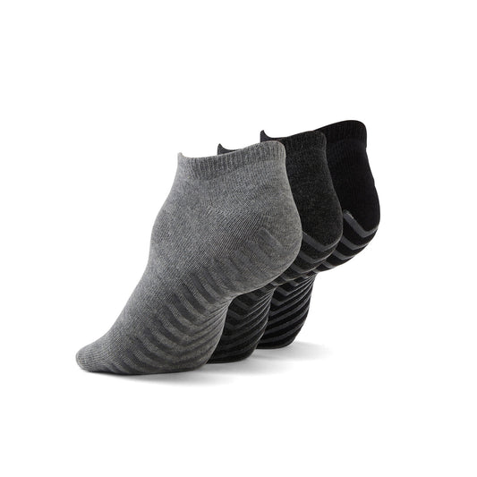
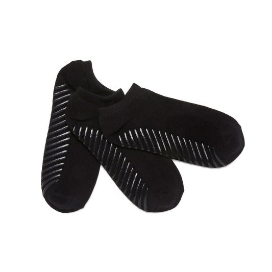
Everyday Crew Anti-Slip Sock's 3 Pack
Breaking the Stigma
One barrier to accessible packaging is perception. There's a lingering idea that "disability-friendly" means clinical, clunky, or cheap-looking. In beauty, where aesthetics matter, brands worry that adaptive features will hurt their image.
But accessible packaging and beautiful design aren't mutually exclusive. Some of the most exciting innovations today combine tactile elements, ergonomic shapes, and clear text with elegant, minimalist aesthetics. Braille integrates seamlessly into sleek labels. Ergonomic pumps can align with a brand's signature look. Text can be large and clear without sacrificing style.
Actually, you could argue that real luxury is design that works for everyone. A jar that only looks good in photos but frustrates users isn't truly premium. A high-end experience should be thoughtful at every touchpoint, including its appearance, feel, and inclusivity.
Reframing the language helps, too. Instead of treating accessible packaging as a "special accommodation," present it as a mark of quality and smart engineering. Highlighting accessibility features in marketing doesn't weaken a brand, but rather, it strengthens it. Consumers increasingly support companies that align with their values, and inclusive design is a tangible way to demonstrate care.
From a business standpoint, ignoring accessibility means leaving customers behind. People with disabilities represent a significant market, and they influence the purchasing decisions of family and friends. When a brand earns a reputation for being thoughtful and functional, word spreads, not just because the product works, but because using it feels respectful.
Future-Proofing Your Routine
Even if you don't currently struggle with packaging, accessibility is still relevant because how you interact with products will change as you age.
Over time, you might notice that fine print gets harder to read, stiff lids feel tougher on your wrists, heavy bottles become harder to grip, and squeezing thick products from tubes feels more tiring.
Choosing accessible brands now is a way of looking out for your future self. It increases the likelihood that you can keep using the products you love comfortably, without needing to replace everything or rely on assistance.
For caregivers supporting aging parents, partners with chronic conditions, or children with disabilities, accessible packaging makes daily routines smoother. Being able to quickly identify products, open them easily, and dispense them without hassle transforms shared moments from stressful to pleasant.
Looking ahead, we are likely to see more innovation, such as refillable systems that snap together without twisting, containers that get lighter as you use them, smart labels with audio instructions, and modular designs with customizable grips. These aren't extras; they're the industry finally catching up to how real, diverse bodies use beauty products.
By supporting accessible design now, you're not just advocating for people who need it today. You're investing in your own future.
How You Can Help!
If this resonates with you, here are simple ways to support accessible skincare:
Audit your stash. Look at what you own and notice what's hard to open, read, or hold. Ask yourself: would someone with less strength or vision find this usable? Keep that in mind when repurchasing.
Support brands that prioritize accessibility. Look for companies that talk openly about design choices: text size, tactile markers, and one-handed operation. Your purchases send a message that these features matter.
Give specific feedback. If you love a formula but struggle with the packaging, tell the brand. Feedback such as "the lid is too stiff" or "the font is too small" can inform future designs.
If you create content, highlight accessibility. Beauty reviewers have influence. Mention when packaging is easy to use, and call out when it isn't. That helps normalize accessibility as a standard evaluation criterion, alongside price and performance.
These small actions collectively push the industry toward better design.
When we talk about accessible skincare packaging, we're really talking about who can fully participate in self-care rituals and who is left out. By embracing universal design, the beauty industry can move beyond surface-level aesthetics and create experiences that genuinely feel good to use.
Accessible packaging doesn't ask brands to sacrifice beauty. It asks them to deepen it—to make products not just visually appealing, but truly welcoming. And that benefits every single one of us, today and in the years to come.
If you enjoyed this blog, please sign up to the June Adaptive Newsletter below to receive more updates!
Share your experience in our 5-minute survey to inform our new adaptive apparel launch. Get a chance to win a $50 gift card Link here