Beyond Makeup: How Rare Beauty and Tilt Beauty Influenced CPG Accessibility Standards
⏳5 minutes of your time could win you a $50 gift card! 🎉Help us design our new adaptive apparel launch by sharing your experience. 👕 Link Here 👈
Beauty has always been personal, but for too long, the beauty industry treated accessibility like an afterthought. A mascara wand that is hard to grip, a moisturizer jar that is painful to open, or a label that is difficult to read can turn a simple daily routine into an unnecessary challenge. Brands like Rare Beauty and Tilt Beauty are helping shift the conversation from “Who is beauty for?” to “Who has beauty been leaving out?” That shift is influencing not only makeup, but the broader consumer packaged goods world.
At June Adaptive, this conversation feels especially familiar. Adaptive fashion and accessible beauty are part of the same movement: products should be designed around real people’s bodies, routines, abilities, and comfort. Whether someone is putting on a shirt, opening a cleanser, applying mascara, or choosing a moisturizer, accessibility should be built into the experience from the beginning.
Industry-wide adoption of accessibility principles
Accessible beauty is not just about adding Braille to packaging or using larger fonts, although those can be helpful. It is about rethinking the entire product experience. Can someone with arthritis open the cap? Can someone with limited dexterity hold the tube? Can someone with low vision identify the product? Can the applicator be used with one hand? Can the product be used on a low-energy day?
Rare Beauty has been especially visible in this shift. The brand’s Made Accessible Initiative identifies accessibility features such as easy-to-use packaging, finishes that allow for a secure grip, and applicators that are comfortable to hold and maneuver with precision. Rare Beauty has also stated that it is partnering with Casa Colina Research Institute to better understand what makes beauty products more accessible and to share those insights more broadly with the beauty industry. (Rare Beauty)
Tilt Beauty has also pushed the conversation forward by centering disability and dexterity from the start. The brand launched in the U.S. with products such as Lashscape Mascara and Grip Stick lip treatment, designed to be easier to hold, open, and apply. Its founder, Aerin Glazer, has spoken about creating the brand after psoriatic arthritis made traditional makeup more difficult to use. (packaginginsights.com)
What makes these brands important is not only their products, but their framing. Accessibility is not being presented as a niche add-on. It is being treated as a design standard.
That matters because consumer packaged goods are used every day. Shampoo, lotion, makeup, deodorant, toothpaste, medication bottles, household cleaners, and food packaging all rely on physical interaction. If that interaction is difficult, painful, confusing, or impossible, the product is not fully serving the customer.
Accessibility principles now gaining wider attention include:
-
Easy-open packaging: Caps, lids, pumps, and closures that require less grip strength or twisting.
-
Tactile identification: Raised symbols, textures, shapes, or markings that help users distinguish products by touch.
-
Ergonomic handling: Packaging shapes designed to be easier to hold, stabilize, and control.
-
Inclusive testing: Product development that includes people with disabilities, chronic conditions, aging-related changes, and dexterity limitations.
These principles are not only useful for people with permanent disabilities. They also help people recovering from surgery, parents holding a child, older adults, people with temporary injuries, and anyone who has ever struggled to open a tiny cap with wet hands. That is the beauty of inclusive design: when done well, it improves the experience for many people.
Guidance documents and design standards emerging from leaders
One reason accessible beauty is moving faster now is that leading brands are beginning to formalize what accessibility actually means. In the past, accessibility was often discussed in broad, feel-good language. Today, the conversation is becoming more practical: grip, twist force, readability, one-handed use, cap design, applicator control, and product differentiation.
Rare Beauty’s Made Accessible Initiative is a good example of this shift. By naming specific design features, such as secure grip finishes and comfortable applicators, the brand is helping make accessibility easier to evaluate. Instead of saying a product is “inclusive” in a vague way, brands are being pushed to explain how the product is inclusive. (Rare Beauty)
This is important because accessibility claims need structure. A brand cannot simply say “easy to use” and expect customers to trust it. Easy for whom? Under what conditions? With what kind of mobility, grip strength, vision, or sensory needs in mind?
A useful accessibility standard should answer questions like:
-
Can the package be opened with limited hand strength?
-
Can the product be identified without relying only on small printed text?
-
Can the applicator be controlled by someone with tremors or limited precision?
-
Was the product tested by people who actually experience these barriers?
-
Does the brand explain its accessibility features clearly and honestly?
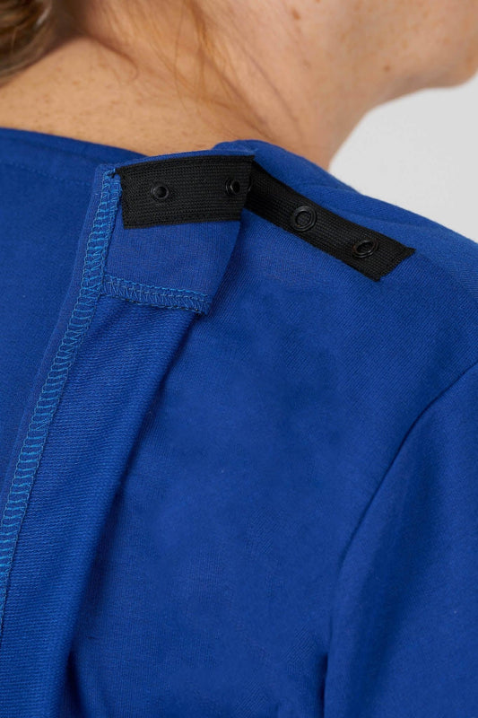
This is where the beauty industry can learn from adaptive fashion. At June Adaptive, accessibility is not just a word. It shows up in closures, fabrics, silhouettes, seated-wear comfort, easy dressing features, and product descriptions that help people choose what works for them. Beauty and CPG brands need the same kind of specificity.
The future of accessible CPG will likely depend on clearer guidance documents, more transparent claims, and stronger collaboration with disabled consumers, occupational therapists, physical therapists, packaging engineers, and inclusive design experts.
Other beauty brands following accessibility pathways
Rare Beauty and Tilt Beauty are part of a broader movement. Other beauty and personal care brands have also been experimenting with accessible packaging, especially around grip, tactile markings, and easier opening.
P&G’s Herbal Essences introduced tactile markings on shampoo and conditioner bottles, using raised lines for shampoo and raised dots for conditioner to help people with low or no vision distinguish between the two products. This initiative was influenced in part by blind designer Sam Latif and showed how a small packaging change can make a daily routine more independent. (Teen Vogue)
Olay, another P&G brand, developed an Easy Open Lid for some of its face creams. The lid was designed with wings for easier opening, a raised and textured top for better grip, and Braille text. It was created with input from consumers, physical therapists, occupational therapists, and user experience experts. (Allure)
These examples matter because they show that accessibility can be integrated into mainstream beauty products, not just specialty products. A moisturizer does not need to look medical to be accessible. A shampoo bottle does not need to be complicated to be inclusive. A mascara does not need to sacrifice style to be easier to use.
Accessible beauty pathways often include:
-
Co-design with disabled users: Brands learn more when they design with people, not simply for them.
-
Packaging that communicates through touch: Raised marks, unique shapes, and texture differences can help users identify products more easily.
-
Grip-conscious design: Wider handles, textured surfaces, and ergonomic shapes can reduce strain.
-
Mainstream availability: Accessibility becomes more meaningful when products are easy to find, not hidden in a separate category.
The most exciting part is that accessible beauty is becoming aspirational. It is not being framed as clinical or secondary. It is being presented as thoughtful, premium, modern, and human.
That matters because people with disabilities deserve products that feel beautiful too.
P&G’s accessibility initiatives influenced by market leaders
P&G’s accessibility work is an important part of the CPG accessibility conversation, though it is worth being precise. Some of P&G’s major accessible packaging initiatives began before newer beauty brands like Tilt Beauty launched and before Rare Beauty’s Made Accessible Initiative became widely discussed. For example, Herbal Essences’ tactile shampoo and conditioner packaging began rolling out in 2019, and Olay’s Easy Open Lid was announced several years before many newer accessible beauty launches. (Teen Vogue)
So rather than saying P&G simply copied newer market leaders, it is more accurate to say the influence runs both ways. Large companies like P&G helped prove that accessibility could scale across mainstream consumer packaged goods. Newer brands like Rare Beauty and Tilt Beauty helped make accessible beauty feel culturally visible, emotionally resonant, and central to brand identity.
Together, these efforts are creating market pressure. When one brand shows that accessible packaging can be beautiful, another shows it can be scaled, and another shows it can be rooted in lived experience, the industry standard begins to shift.
P&G’s initiatives also show why accessibility cannot stay limited to makeup. Personal care products are used in bathrooms, showers, bedrooms, hospitals, dorms, care homes, and shared family spaces. These are real environments where wet hands, fatigue, low vision, pain, tremors, or limited mobility can affect product use.
A shampoo bottle with tactile marks can support independence. A moisturizer lid with easier grip can reduce pain. A deodorant cap that opens smoothly can save time and frustration. These are small moments, but they add up.
Accessible CPG is not only about disability inclusion. It is also about dignity, privacy, independence, and ease.
Accelerated innovation timeline in accessible beauty
The accessible beauty timeline has accelerated because consumers are more vocal, social media makes product barriers visible, and brands are recognizing that inclusive design is not just ethical, but commercially smart.
For years, accessibility issues were treated as individual problems. If someone could not open a product, the assumption was often that they needed help. Now, more consumers are asking a better question: why was the product designed that way in the first place?
That question is changing the market.
Rare Beauty’s visibility has helped bring accessibility into mainstream beauty conversations, especially because Selena Gomez has spoken publicly about how arthritis related to lupus influenced some packaging decisions. Reports have noted that her experience with dexterity challenges helped shape accessible and user-friendly product choices, including the brand’s cap-free fragrance dispenser. (People.com)
Tilt Beauty adds another layer by building its brand identity around disability-informed design from the beginning. That is an important difference. Accessibility is not being retrofitted after launch. It is part of the brand’s foundation. (packaginginsights.com)
This creates a faster innovation loop. Consumers share what works. Disabled creators review products. Brands see demand. Packaging teams test new designs. Competitors respond. Retailers begin to notice. What once took decades can now move in years.
Innovation is showing up in several ways:
-
More ergonomic packaging: Products are being shaped for easier grip, not just shelf appeal.
-
More inclusive storytelling: Brands are featuring disabled users and founders as part of the product story.
-
More research partnerships: Companies are working with research institutes, therapists, designers, and consumers to validate accessibility choices.
-
More pressure for transparency: Customers increasingly want brands to explain what makes a product accessible, not just claim it.
This momentum is powerful, but it also needs accountability. Accessibility should not become a trend that disappears when the next beauty buzzword arrives. It needs to become part of product development, testing, packaging standards, retail education, and customer service.
What accessible beauty can teach all CPG brands
Accessible beauty has lessons for every consumer packaged goods company. The first lesson is that packaging is part of the product. A formula may be excellent, but if the bottle is impossible to open, the product fails the user.
The second lesson is that accessibility should be designed early. Retrofitting can help, but it often leads to compromises. When accessibility is considered from the start, brands can create products that look beautiful, function well, and support more people.
The third lesson is that inclusive design is not about lowering standards. It is about raising them. A product that is easier to hold, easier to open, easier to identify, and easier to apply is usually a better product overall.
This is the same principle behind adaptive fashion. A well-designed adaptive garment should not feel like a workaround. It should feel like clothing that was thoughtfully made. Similarly, an accessible beauty product should not feel like a medical device unless that is the intended purpose. It should feel desirable, personal, and empowering.
For CPG brands, accessibility should become a normal part of product briefs. Teams should ask:
-
Who might struggle to open this?
-
Who might struggle to read this?
-
Who might struggle to hold this?
-
Who might need to use this seated, one-handed, or with limited energy?
-
Who has been left out of our testing process?
These questions do not slow innovation. They make innovation better.
Why this matters for inclusive design
The rise of accessible beauty reflects a larger cultural shift. Consumers are no longer satisfied with products designed for an imaginary “average” person. People want products that reflect real bodies, real routines, and real needs.
That is why brands like Rare Beauty, Tilt Beauty, Olay, and Herbal Essences are important to the broader CPG landscape. They show that accessibility can be practical, emotional, beautiful, and scalable. They also show that inclusive design is not limited to one industry.
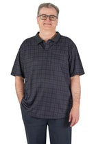
At June Adaptive, we see this every day in the world of clothing. A zipper placement, magnetic closure, open-back design, seated fit, soft fabric, or easy-access pocket can change how someone experiences getting dressed. Beauty products have the same potential. So do household products, food packaging, personal care items, and wellness tools.
The future of CPG accessibility will not be built by one brand alone. It will come from shared standards, consumer advocacy, disability-led innovation, and companies willing to treat accessibility as a core design requirement.
Accessible beauty is not beyond makeup because makeup is unimportant. It is beyond makeup because the lessons are bigger than beauty. They are about independence, dignity, and the right to participate in everyday routines without unnecessary barriers.
Take a look at some of our wonderful products that ensure that comfort and accessibility is possible.

Women’s Adaptive Open-Back Tonal Knit Dress

Men’s Back-Overlap Assisted Dressing Twill Pants

Women's Easy-Access Open-Back Floral Snap Top
Final thoughts
Rare Beauty and Tilt Beauty have helped make accessible beauty more visible, desirable, and commercially relevant. P&G’s work through brands like Olay and Herbal Essences shows that accessibility can also scale across mainstream personal care. Together, these examples are influencing how the broader CPG industry thinks about packaging, usability, and inclusive design.
The next step is consistency. Accessibility should not depend on a special launch, a limited-edition product, or a single founder’s personal story. It should be part of how products are built from the start.
That means better testing, clearer standards, more transparent communication, and more disabled consumers involved in the design process. It also means recognizing that accessibility is not a niche concern. It is a better way to design for everyone.
If you enjoyed this blog, please sign up to the June Adaptive Newsletter below to receive more updates! Share your experience in our 5-minute survey to inform our new adaptive apparel launch. Get a chance to win a $50 gift card Link here .