Written by Samantha Jafar
⏳5 minutes of your time could win you a $50 gift card! 🎉Help us design our new adaptive apparel launch by sharing your experience. 👕 Link Here 👈
Introduction
For many consumers, packaging is a visual experience. Colors signal scent. Fonts signal brand identity. Subtle design differences distinguish similar products. In categories like beauty, hygiene, and food, visual cues are often the primary way people identify and select items.

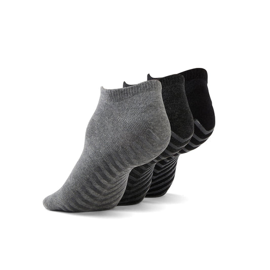
Kid's Pink Multi Anti-Slip Socks (4 pairs)
Tactile marking systems for quick product identification
Tactile marking systems allow users to identify products by touch rather than sight. For blind and low vision consumers, this can transform daily routines.
Common tactile strategies include:
-
Braille labeling with product name or category
-
Raised symbols indicating function, such as shampoo versus conditioner
-
Distinct textures for different product types
-
Embossed lines or shapes placed consistently on packaging
Braille remains one of the most direct ways to communicate information non visually. When integrated into packaging rather than added as a sticker, it becomes a durable and reliable feature. Proper spacing, dot height, and placement are essential to ensure readability.
Beyond Braille, tactile differentiation can be highly effective
For example:
-
A raised circle on one product and a raised square on another
-
Horizontal ridges on morning products and vertical ridges on evening products
-
Textured grips on medicated or high risk items
Consistency really matters. When a brand uses tactile symbols, they should keep them the same across all products. If the raised mark is always in the same spot and always means the same thing, people can learn it once and trust it every time. That predictability builds comfort and confidence.
Tactile features also help people who have partial vision, not just those who are fully blind. Many people use both sight and touch together. A small raised symbol or textured detail can quickly confirm that they have the right product in their hand, without needing to grab a magnifier or strain to read tiny text.
High-contrast color combinations that work for low vision users
Not everyone with a visual impairment is completely blind. Many people have low vision, struggle to see contrast clearly, or have difficulty telling certain colors apart. For them, strong color contrast is not just a design choice. It is what makes the difference between being able to read a label easily and not being able to read it at all.
High contrast combinations improve readability and product recognition.
Effective pairings often include:
-
Black text on white background
-
White text on dark blue or black
-
Dark green text on pale yellow
-
Bold color differences between cap and bottle
Poor contrast, such as light gray text on white or pastel lettering on glossy surfaces, reduces legibility. Metallic finishes and reflective coatings can also create glare, making reading more difficult.
Design guidelines for low vision accessibility typically emphasize:
-
Strong contrast between text and background
-
Avoidance of overly decorative fonts
-
Clear differentiation between similar product variants
-
Matte finishes that reduce glare
Color should not be the only way products are separated or identified. For example, using red for one product and green for another might seem clear, but it does not work for people who have color vision deficiencies. If color is paired with clear text and small tactile cues, it becomes much easier for everyone to tell products apart with confidence.
When high contrast becomes part of brand identity, it does not diminish aesthetics. Many modern brands successfully combine bold, clean contrast with premium design.
Font sizing and readability standards emerging in the industry
Font size is one of the most common barriers in packaging design. Ingredient lists, usage instructions, and warnings are often printed in very small type to fit limited surface space.
For people with low vision, small font size can make essential information inaccessible.
Emerging best practices in the industry emphasize:
-
Larger minimum font sizes for critical information
-
Clear, sans serif fonts that reduce visual clutter
-
Adequate spacing between lines
-
Avoiding condensed or overly stylized typefaces
In the United States, the Food and Drug Administration sets certain labeling rules for food and drug packaging, including minimum type sizes for some products. While beauty and cosmetic items are not always held to the same strict standards, these regulations still influence how brands think about label design. They help shape expectations around clarity, safety, and basic readability.
International guidance also plays a role. Organizations such as the World Health Organization contribute to global conversations about health communication and accessible information. Even when their recommendations are not directly enforced in every country, they influence industry best practices and broader accessibility standards.
More importantly, designers are starting to see that readability is not just about following rules. It is about real people trying to use a product safely and confidently. Small fonts, crowded layouts, and low contrast text can create frustration and risk. Clear, readable labels improve user experience, build trust, and make products more inclusive for everyone, not just those with diagnosed visual impairments.
Enlarging font size may require creative layout solutions, such as:
-
Expanding secondary packaging surfaces
-
Using fold out labels
-
Incorporating digital access points for extended information
Readable packaging supports safety, especially for products with active ingredients or usage restrictions.

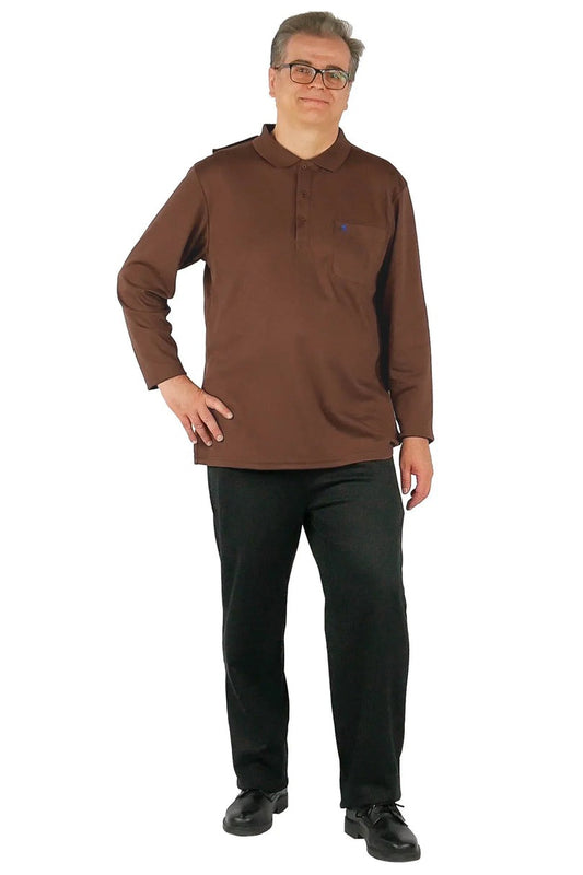
Choose Balance - Gender Neutral Sweatshirt
Audio QR codes and smart packaging technology
Technology offers new opportunities to enhance accessibility. QR codes linked to audio descriptions allow users to scan packaging with a smartphone and receive spoken information.
Audio-enabled packaging can provide:
-
Product name and variant
-
Usage instructions
-
Ingredient details
-
Expiration information
-
Safety warnings

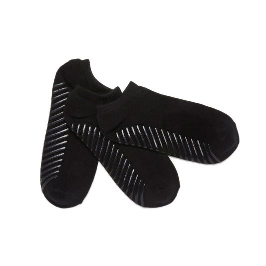
Diabetic Anti-Slip Socks (3 pairs)
Organizations like Be My Eyes demonstrate how digital tools can support blind and low vision communities. Integrating audio QR codes into packaging builds on this ecosystem.
For audio solutions to be effective, brands should consider:
-
Clear placement of the QR code
-
Tactile markers indicating where to scan
-
Simple, direct audio scripts
-
No requirement for complex app navigation
Smart packaging can also include near field communication tags or other scannable elements that connect users to accessible digital content. With a simple tap or scan, someone could hear the product name, detailed instructions, ingredient information, or safety warnings read aloud. This can be especially helpful for products with long labels or small print that are difficult to navigate.
These technologies open the door to more detailed and customizable information. For example, audio instructions could be offered in multiple languages, or users could choose between a short summary and a more in depth explanation. Updates could also be made digitally without changing the physical packaging.
At the same time, technology should support accessibility, not replace basic physical design improvements. Not everyone has a smartphone nearby in the shower, at the sink, or in the kitchen. Batteries die, apps crash, and internet access is not always reliable. If the only accessible information lives behind a scan, some users are still left out.
That is why combining physical and digital accessibility creates stronger support. Tactile markings, high contrast text, and readable fonts make products usable on their own. Smart features then add another layer of access and independence. Together, they create packaging that works in real world conditions, not just ideal ones.
Feedback from blind and low vision consumers on current offerings
Listening to users is essential. Feedback from blind and low vision consumers consistently highlights several themes.
Common challenges include:
-
Identical packaging for different product variants
-
Small or low contrast text
-
Lack of Braille or tactile identifiers
-
Over reliance on color coding
Consumers often express frustration when:
-
Shampoo and conditioner bottles are indistinguishable
-
Medication instructions cannot be read independently
-
Product differentiation relies only on subtle visual cues
At the same time, positive feedback emerges when brands implement inclusive features:
-
Integrated Braille that feels permanent
-
Consistent tactile markers across product lines
-
High contrast labels that remain stylish
-
Audio tools that provide clear, concise information
Users frequently emphasize independence. Being able to identify and use products without assistance is not simply convenient. It supports dignity and confidence.
Brands that actively gather feedback through surveys, user testing panels, and advocacy partnerships gain deeper insight into real world challenges. Accessibility should not rely on assumptions. It should be shaped by lived experience.
Final Thoughts
Navigating packaging with a visual impairment should not feel like solving a daily puzzle. With thoughtful design choices, brands can create products that are both visually compelling and genuinely accessible.
Tactile marking systems allow identification by touch. High contrast color combinations improve clarity for low vision users. Larger fonts and readable layouts support safe use. Audio QR codes and smart packaging extend access beyond the physical label. Most importantly, direct feedback from blind and low vision consumers guides meaningful improvement.
Accessibility is not a niche concern. Vision loss affects millions of people globally, and the population continues to age. Inclusive packaging design benefits a broad and growing audience.
When brands expand their design approach beyond sight alone, they create packaging that works for more people. Thoughtful accessibility does not limit creativity. It strengthens it.
If you enjoyed this blog, please sign up to the June Adaptive Newsletter below to receive more updates.
⏳5 minutes of your time could win you a $50 gift card! 🎉Help us design our new adaptive apparel launch by sharing your experience. 👕 Link Here 👈