⏳5 minutes of your time could win you a $50 gift card! 🎉Help us design our new adaptive apparel launch by sharing your experience. 👕 Link Here 👈
A product can be beautifully designed and still fail someone before they ever use it. If it is placed too high on a shelf, labeled in tiny text, hidden behind unclear packaging, or listed online without accessibility details, many customers are left guessing. For people with mobility, vision, sensory, or dexterity disabilities, the shopping experience itself can become the barrier. At June Adaptive, we believe accessibility should travel with the product, from shelf to screen and all the way into daily life.
Common in-store barriers for people with mobility and vision disabilities
Consumer packaged goods, or CPG products, are the everyday items people buy again and again: skincare, body wash, laundry detergent, cleaning products, snacks, personal care items, and more. Because these products are so routine, brands sometimes assume they are easy to shop for. But “routine” does not always mean accessible.
The CDC reports that more than 1 in 4 adults in the United States has some type of disability, which means accessible shopping is not a small edge case. It affects a major part of the customer base. (CDC)
In-store shopping can be especially difficult because customers have to navigate physical spaces, crowded aisles, shelves, lighting, signage, packaging, and checkout processes. A person using a wheelchair may not be able to reach a product on the top shelf. Someone with low vision may struggle to read small labels or distinguish between similar products. A person with arthritis may avoid products with hard-to-open caps. Someone with chronic fatigue may need to shop quickly and cannot spend 20 minutes comparing unreadable ingredient lists.
Common in-store barriers include:
-
Products placed too high or too low: Shelf placement can make a product unreachable for wheelchair users, people of short stature, older adults, or anyone with limited shoulder mobility.
-
Small or low-contrast text: Ingredients, directions, warnings, and product benefits may be technically present, but not readable for many shoppers.
-
Overcrowded displays: Busy shelves and promotional displays can make navigation harder for people using mobility aids, service animals, canes, walkers, or carts.
-
Hard-to-identify product variations: If fragrance-free, sensitive-skin, adaptive, or easy-open versions are not clearly marked, customers may have to pick up multiple products just to find the right one.
The Americans with Disabilities Act applies to many businesses open to the public, including shops, and is designed to ensure people with disabilities have access to goods and services. (ADA.gov) ADA guidance also emphasizes effective communication, including making information available in formats such as large print, Braille, electronic formats, or audio when needed for people who are blind or have vision loss. (ADA.gov)
For CPG brands, this means accessibility is not only the retailer’s job. Brands influence packaging, labeling, shelf displays, promotional materials, product education, QR codes, and online listings. A brand that wants to be inclusive should think about how people discover, compare, reach, open, and understand its products in real shopping environments.
This is similar to adaptive fashion. A garment is not truly accessible only because it has one helpful feature. The full experience matters: finding the item, understanding the fit, choosing the size, opening the package, dressing comfortably, and wearing it confidently. CPG brands should apply that same full-journey thinking.
Designing shelf layouts and displays for reach and readability
Retail shelves are often designed around sales strategy: eye-level placement, promotional endcaps, brand blocks, and seasonal displays. Those decisions matter commercially, but they also affect who can access the product.
A shelf that works for a standing shopper with full mobility may not work for someone seated in a wheelchair. A high-gloss display may look premium but create glare for shoppers with low vision. A beautiful pastel label may match the brand palette but fail in a fluorescent store aisle.
Accessible shelf and display design starts with a practical question: can people find, reach, read, and choose the product without unnecessary strain?
Brands and retailers can improve accessibility by considering:
-
Reach-friendly placement: Place essential, frequently purchased, or accessibility-specific products within more reachable shelf zones when possible. This is especially important for products labeled sensitive skin, fragrance-free, easy-open, adaptive, or caregiver-friendly.
-
High-contrast signage: Use large, clear text with strong contrast for category markers, product benefits, and accessibility callouts.
-
Simplified product grouping: Group related accessible options together, such as fragrance-free laundry products, sensitive-skin body care, or easy-open packaging formats.
-
Readable shelf tags: Make price tags, product names, and key features large enough to read without needing to bend, stretch, or take a photo and zoom in.
Shelf design should also avoid making accessible products feel hidden or medicalized. Accessibility should not be tucked away in an obscure corner as if it belongs outside everyday life. A fragrance-free body wash, a gentle detergent, an adaptive clothing product, or an easy-open container should be easy to find and presented with the same dignity as any other premium product.
A helpful comparison is the grocery store cereal aisle. Imagine trying to compare nutrition labels, prices, package sizes, ingredients, allergens, and flavors while seated, holding a cane, managing fatigue, or shopping with low vision. Now apply that same challenge to body wash, skincare, cleaning sprays, or clothing care products. The easier the shelf is to scan, the less exhausting the shopping experience becomes.
For June Adaptive, this connects closely to how adaptive fashion should be presented. Adaptive apparel should not be treated like an afterthought or hidden in a separate category with limited visibility. It should be discoverable, attractive, clearly explained, and easy to compare. The same standard should apply to accessible CPG products.
Online product pages that support screen readers and keyboard navigation
Online shopping can remove some in-store barriers, but it can create new ones. A customer no longer has to reach the top shelf, but they may have to navigate a website that does not work with a screen reader, keyboard, voice control, magnification software, or captions.
ADA web guidance explains that people with disabilities navigate the web in many ways. People who are blind may use screen readers, people who are deaf or hard of hearing may rely on captions, and people with disabilities affecting hand use may use voice recognition software instead of a mouse. (ADA.gov)
This matters for CPG and adaptive product pages because online listings often carry the information customers need most. If that information is trapped in an image, hidden in a dropdown that cannot be opened by keyboard, or described only in a video without captions, the product page is not fully accessible.
The W3C Web Accessibility Initiative develops standards and support materials for making the web accessible, while WCAG provides recommendations for making web content more accessible. (W3C) (W3C) For brands, this should translate into practical product page decisions.
An accessible product page should include:
-
Screen-reader-friendly structure: Use proper headings, descriptive links, alt text for images, and meaningful button labels like “Add fragrance-free body wash to cart” instead of vague labels like “Click here.”
-
Keyboard navigation: Customers should be able to tab through product images, size options, scent options, quantity selectors, reviews, and checkout without using a mouse. WebAIM notes that keyboard navigation can be especially demanding when users must tab through lengthy navigation before reaching the desired item. (WebAIM)
-
Accessible images and videos: Product photos should include alt text that explains meaningful details, such as “front-opening adaptive shirt with magnetic closures” or “pump bottle with large, easy-press dispenser.” Videos should include captions and, when possible, audio descriptions for important visual information.
-
Plain-language product details: Use clear words for ingredients, features, sizing, closures, textures, scent level, care instructions, and accessibility benefits.
For a June Adaptive customer, these details are not small. If someone is shopping for adaptive clothing after surgery, for an aging parent, or for themselves while managing fatigue, they need answers quickly. Does the top open in the front? Are there buttons, magnets, zippers, or Velcro? Is the fabric soft? Is it seated-friendly? Does it work for limited shoulder mobility? These details should not be buried in a photo carousel or vague marketing copy.
The same applies to CPG. Customers should not have to search reviews to find out whether a bottle has a pump, whether a product is fragrance-free, whether the label is readable, or whether the package is easy to open. Accessibility information should be part of the main product description.
Clear, searchable accessibility information on product features
One of the biggest missed opportunities in CPG is making accessibility features searchable. Many products have helpful features, but customers cannot find them because the right words are missing from the product page, packaging, search filters, or retailer listing.
For example, a customer may search for:
-
“easy-open shampoo bottle”
-
“fragrance-free detergent”
-
“body wash pump bottle”
-
“large print label skincare”
-
“sensitive skin hand soap”
-
“adaptive clothing magnetic closure”
-
“seated pants wheelchair friendly”
-
“one-handed use cleaning spray”
If the product page does not include those words, the customer may never find the product, even if it would meet their needs.
Clear accessibility information helps both shoppers and search engines. It improves SEO while also reducing customer confusion. For brands, this is a win-win: better discoverability and better service.
Product pages should clearly answer:
-
Who might benefit from this product?
-
What accessibility features does it include?
-
What limitations should customers know before buying?
-
Is the packaging easy to grip, open, pump, squeeze, or dispense?
-
Is the formula fragrance-free, low-scent, sensitive-skin friendly, or dye-free?
-
Is the product compatible with seated use, one-handed use, caregiver support, or limited dexterity?
-
Are instructions available in large print, digital text, or another accessible format?
This kind of communication also builds trust. Accessibility should not be exaggerated. If a package is easier to open than a traditional bottle but still requires two hands, say that. If a garment has magnetic closures but may not work for people with certain implanted medical devices, explain that clearly. If a product is fragrance-free but not certified eczema-friendly, be honest.
For June Adaptive, transparency is central to customer confidence. People shopping for adaptive products are often trying to solve a real daily challenge. They are not just browsing. They may be looking for independence after surgery, comfort during cancer treatment, dignity in assisted dressing, or clothing that works better with mobility aids. Clear information helps customers make choices that fit their lives.
Partnering with retailers to standardize accessibility cues
Even when brands do everything right on their own packaging and website, the retail environment can still be inconsistent. One retailer may display accessibility features clearly. Another may hide them in a long product description. One store may group sensitive-skin products together. Another may scatter them across the aisle. One website may have useful filters. Another may only let shoppers filter by price, brand, and rating.
This is why retailer partnerships matter. Brands and retailers should work together to standardize accessibility cues across shelves, packaging, and online listings.
A standardized accessibility system could include:
-
Shelf icons: Simple, consistent icons for features like easy-open, fragrance-free, sensitive skin, large print label, one-handed use, or seated-friendly design.
-
Online filters: Retailers can add filters for accessibility features, just as they already do for price, size, brand, color, scent, or material.
-
Product data fields: Brands can provide structured accessibility information to retailers, so product features appear consistently across websites.
-
Staff education: Store associates should know where accessible products are located and how to assist customers respectfully.
This does not mean reducing people to labels. It means making useful product information easier to find. Just as shoppers can filter for “gluten-free,” “vegan,” “fragrance-free,” or “wide width,” they should be able to find accessibility features without detective work.
Retailers already standardize many shopping cues because they know customers rely on shortcuts. A green leaf may suggest plant-based. A bold allergen label may flag peanuts. A size chart helps customers choose clothing. Accessibility deserves the same level of clarity.
This approach also supports caregivers. Someone shopping for a parent, partner, child, or client may not know every technical term. Clear retail cues can help them choose products that are easier to open, gentler on skin, or better suited to limited mobility.
For brands like June Adaptive, retailer partnerships can help normalize adaptive products. Instead of treating adaptive clothing as a specialty category hidden away from mainstream shoppers, retailers can make inclusive features visible, searchable, and easy to understand. That visibility helps more people discover that comfort and accessibility are available to them.
Take a look at some of our wonderful products that ensure that comfort and accessibility is possible.

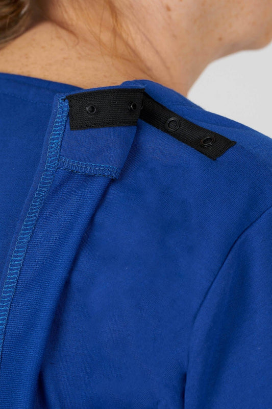
Women's Easy-Access Open-Back Floral Snap Top

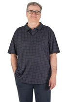
Men’s Adaptive Back-Opening Bamboo Sport Shirt

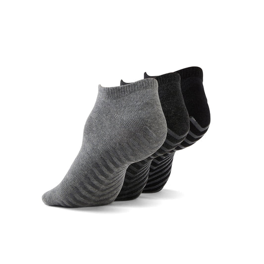
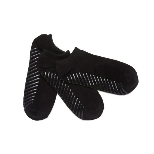
Unisex Diabetic Socks with Seamless Toe & Non-Binding Cuff
Final thoughts
Accessible CPG does not stop at the product itself. It includes where the product sits on the shelf, how readable the label is, how clearly features are explained, whether the website works with assistive technology, and whether retailers make accessibility easy to search and compare.
From shelf to screen, every touchpoint can either reduce friction or add another barrier. For people with mobility disabilities, vision disabilities, sensory sensitivities, limited dexterity, chronic illness, or caregiver-supported routines, these details shape the entire shopping experience.
At June Adaptive, we believe inclusive design should be visible, practical, and empowering. Whether someone is buying adaptive clothing, fragrance-free detergent, sensitive-skin body wash, or an easy-open package, they deserve clear information and a shopping experience that respects their needs.
The future of accessible CPG is not about creating separate aisles for separate people. It is about building better systems so everyone can find, choose, and use the products that make daily life easier.
If you enjoyed this blog, please sign up to the June Adaptive Newsletter below to receive more updates! Share your experience in our 5-minute survey to inform our new adaptive apparel launch. Get a chance to win a $50 gift card Link here